|
This semester went by very quickly, however it was nice to be back in person for art. I think that I've improved a decent bit since my freshman year in art and I'm happy with the work i've produced.
0 Comments
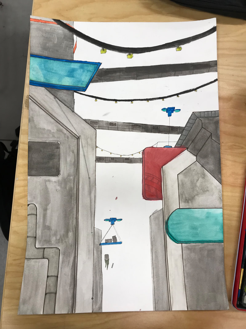
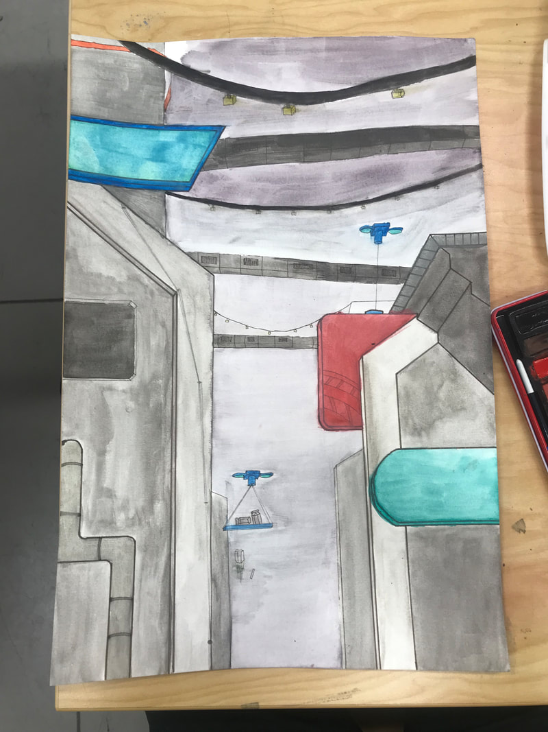
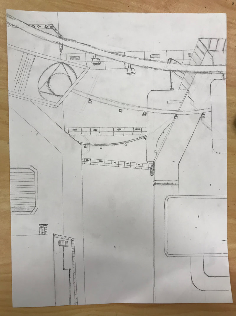
Final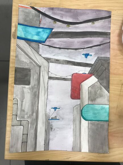 Process: I used pen and watercolor to create layers and depth in my travel poster. Medium: I haven't used watercolor in awhile but I enjoyed it. The paint is easy to blend and the colors layer really well. Reflection: I think I did really well on this by capturing the scene while keeping it in the style the posters its based on are in. Inspiration: I was inspired by the national park posters that I've seen and collected a few of over my travels. I really like the idea of capturing a place with a simple almost cartoon-ish photo. Inprogress
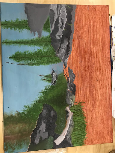
References 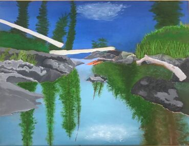 Process: I took a lot of time on trying to create detail on the rocks and trees. I had to learn a lot while creating this piece.
Medium; I actually enjoy oil and I think if I had more time to work a piece with a subject I am interested in I could create something interesting. Reflection; I think that the landscape came out better than I thought it would but it could definitely use more depth and contrast. The colors really do seem flat as well i should used more shadows and highlights. Inspiration; I enjoy taking photos when I travel and this was on of my favorite photos from Yosemite so I decided to paint it.
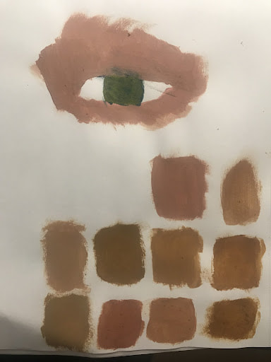
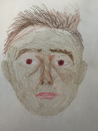
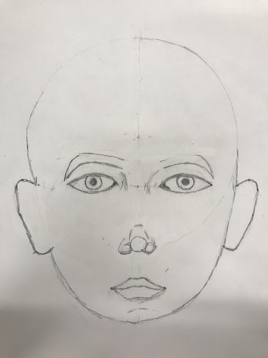
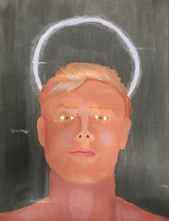
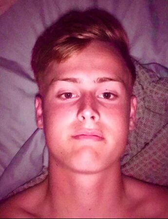
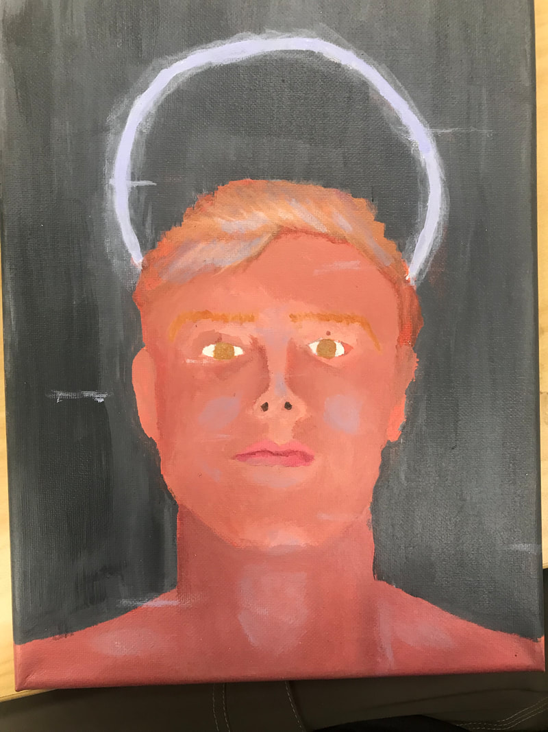
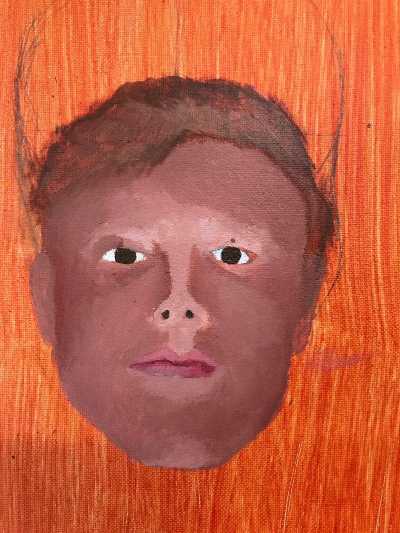
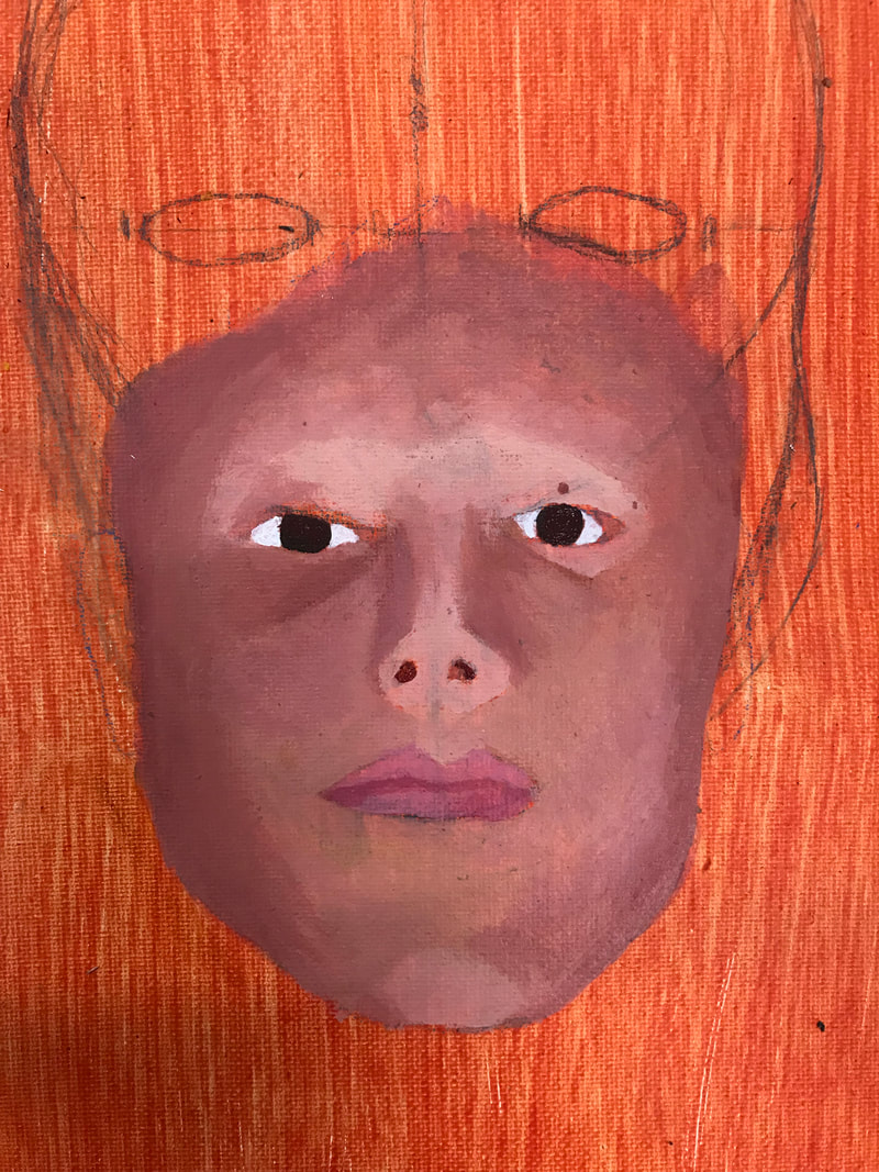
Process; There must be at least 30 layers on paint on the canvas it was simply trial and error over and over until I was happy with the result. It took me awhile to get the light correct but the skin tones and shadow was definitely the most difficult. Medium; I still dislike acrylic it just dries way too quickly for my taste. Reflection; I think that the portrait came out better than I thought it would but it could definitely use more depth and contrast. I do really like the way the lights cast a shadow on the cheeks and neck. Inspiration; I decided to to a brushed metal background because I enjoyed the sci-fi appearance to it. I also added the halo and tried to make it appear as a neon light to add to the sci-fi appearance. Inprogress
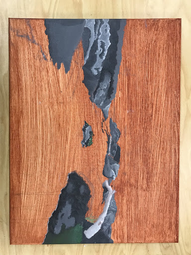
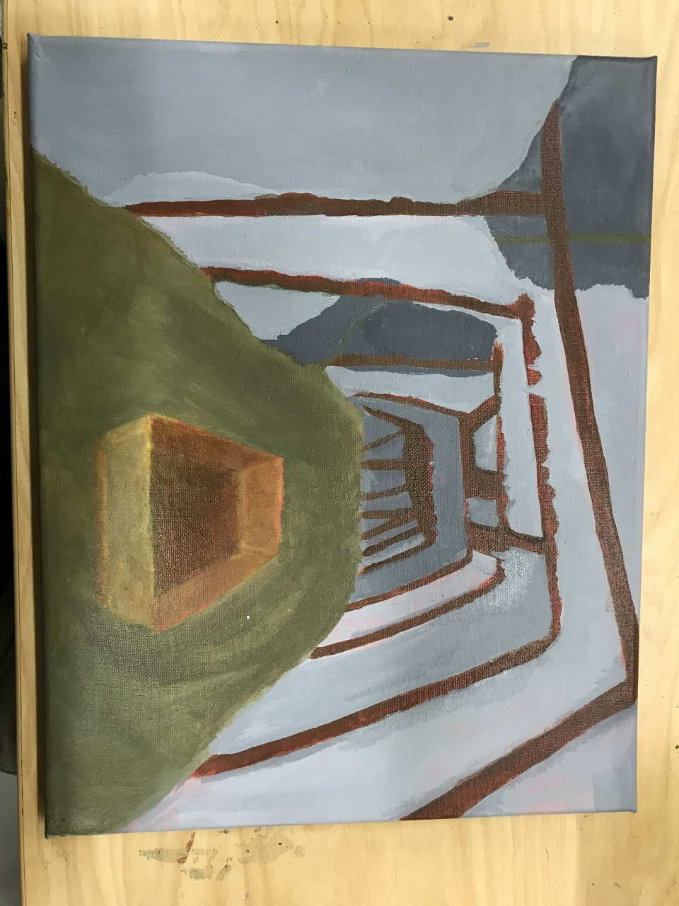
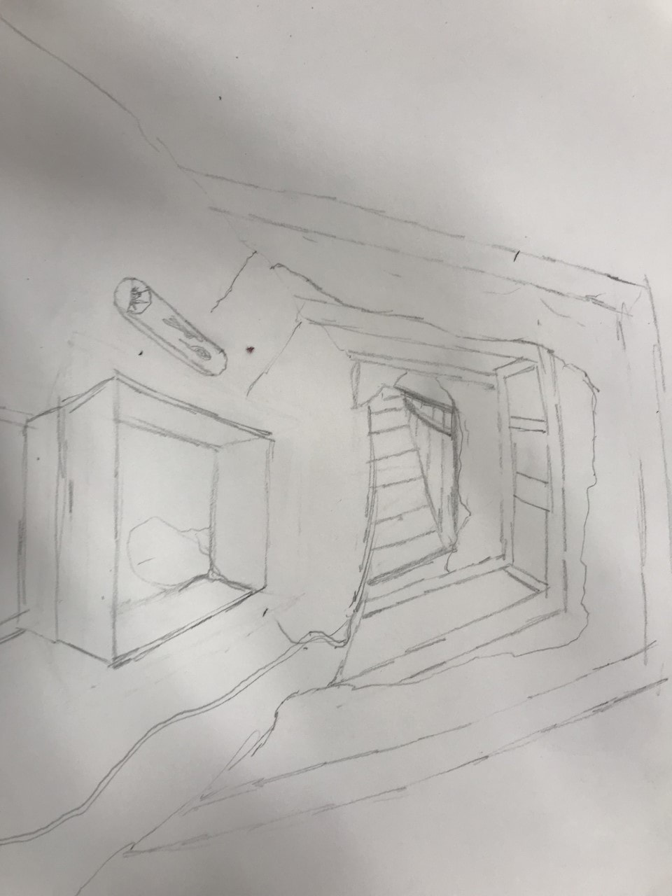
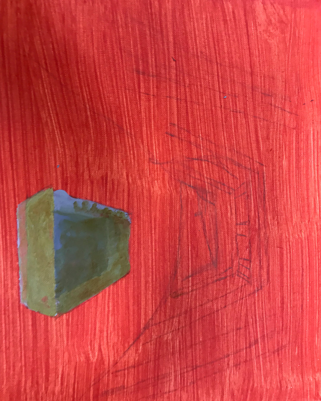
Final: 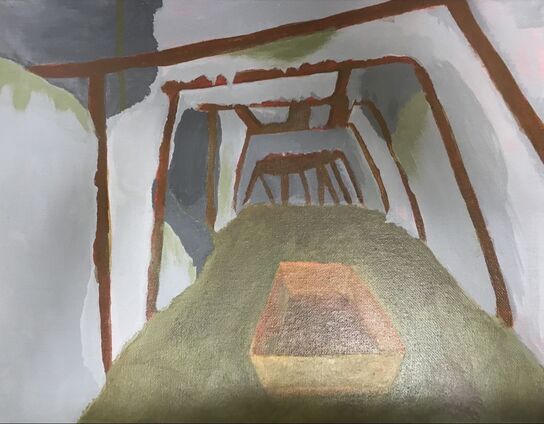 Describe your investigation of materials? How do the materials you chose relate to or effectively communicate the idea behind your work? The interior spaces project was not one of my favorites I struggled with putting depth and texture into the piece. The idea behind painting a cave as an interior space was to show a dark place that just kept getting darker and farther from the light. School this year has just been a slippery slope of stress and darkness for a lot of people I know and I thought I could represent it in this painting. The practice was helping to build on my sparse painting skills How did practice and revision guide your end product? Describe your process when creating this work When creating the piece Inprogress photos:
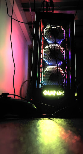
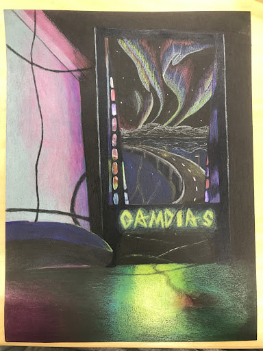
When brainstorming for my reflection project I was tasked with creating a piece that contained a reflection but at the same time reflected something in my life. I decided that my computer would be a great focal point for this project. Once I had decided I would be using my computer in the piece I had to find a place to put a reflection and I figured the glass in the front of the tower would be perfect. I choose the highway image to put in my reflection because it showed an amptosphere where I am happy. I think the piece turned out okay, there was a lot of proportion errors and darkness in the piece. I believe if I had taken a brighter photo with more light in the background the artwork may have turned out better. I am very proud of the detail in the reflection on the glass of the tower.
|
AuthorWrite something about yourself. No need to be fancy, just an overview. ArchivesCategories |

 RSS Feed
